Interactive Video
Designed the interactive video feature for Verb, enabling entrepreneurs to add shoppable elements, links, and calls-to-action directly within video content. Solved critical usability issues that emerged after post-acquisition integration of nFusz technology into the platform.
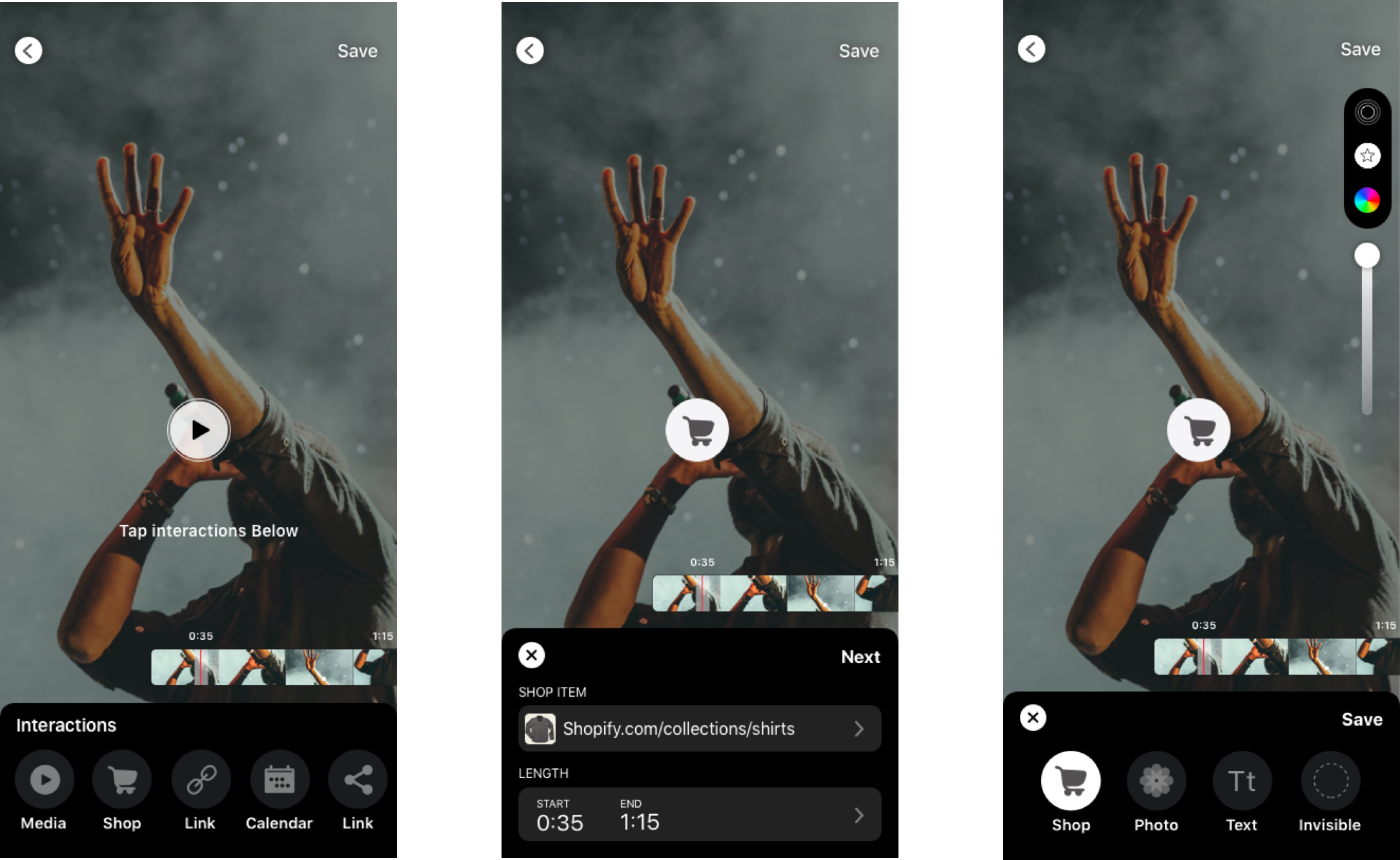
Before: The Original Experience
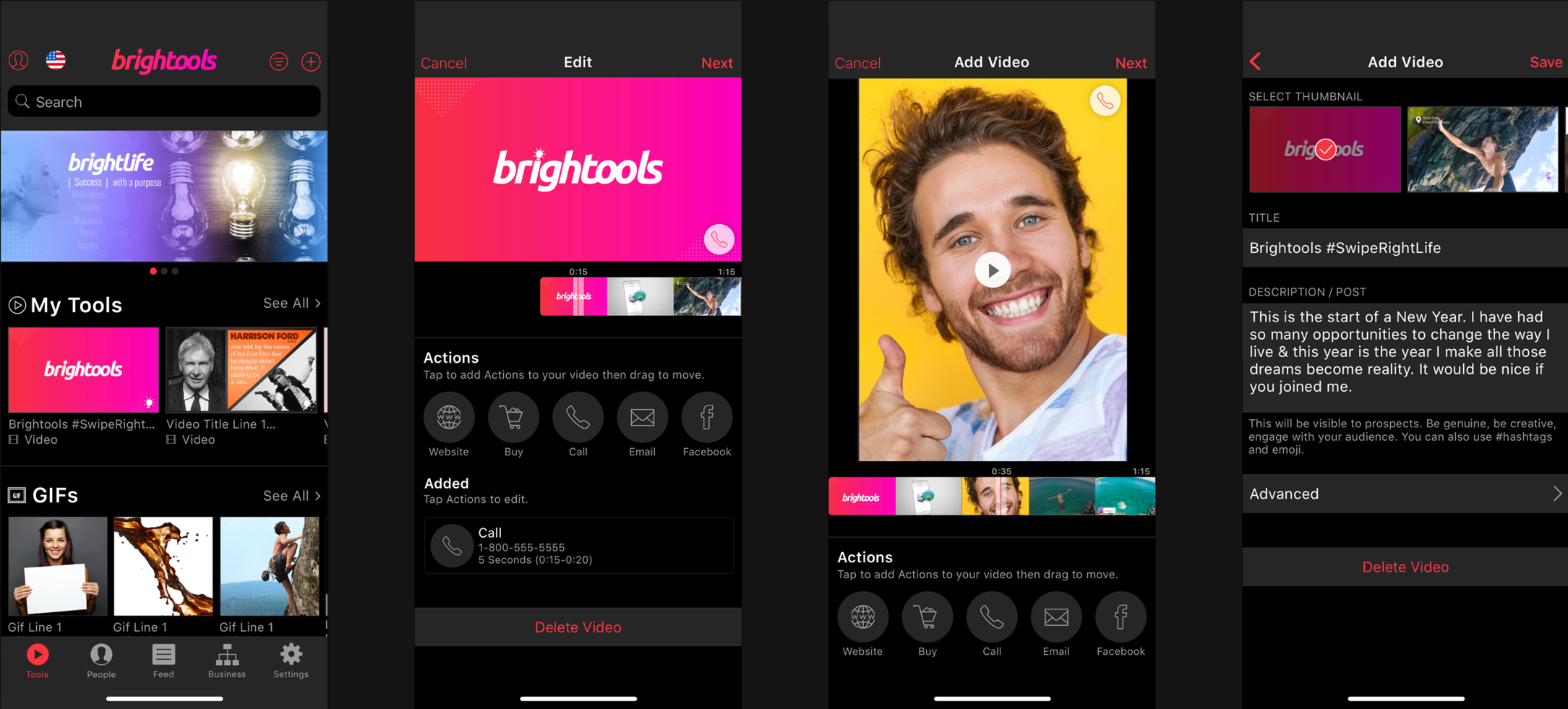
The Problem
After acquiring nFusz, Verb integrated the interactive video technology into their CRM platform. But users weren't engaging with it as designed. The initial rollout revealed that customers struggled with three core interactions: styling interactive elements, managing the full-screen video experience, and switching between information and interactivity views.
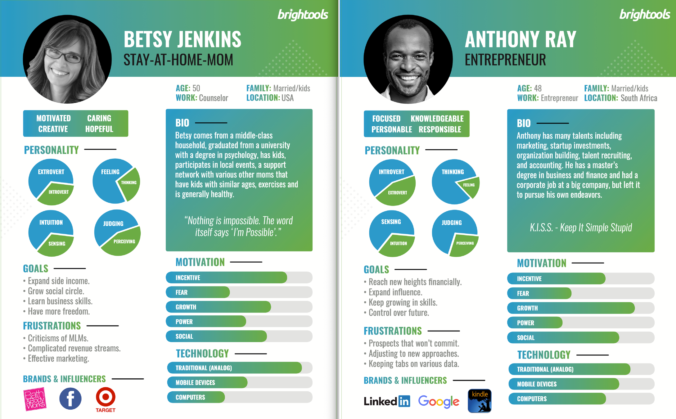
The product served white-labeled app users. Specifically direct sales company distributors who needed simple, intuitive tools to enhance their video content with sellable products and calls-to-action.
Personas
Ideation Process
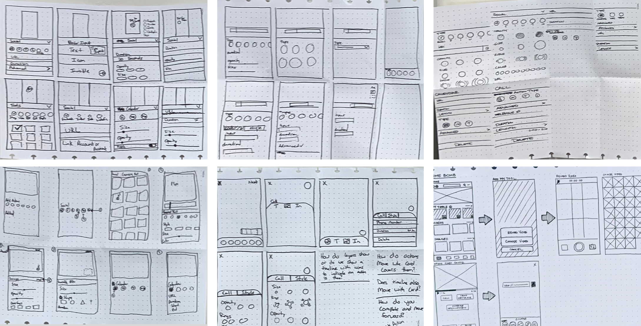
We used Crazy 8s methodology to generate a high volume of ideas across all three problem areas. Every team member participated to encourage divergent thinking. After brainstorming, we heat-mapped and voted on the strongest concepts.
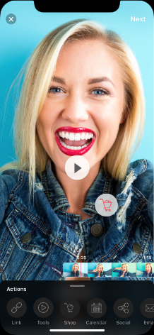
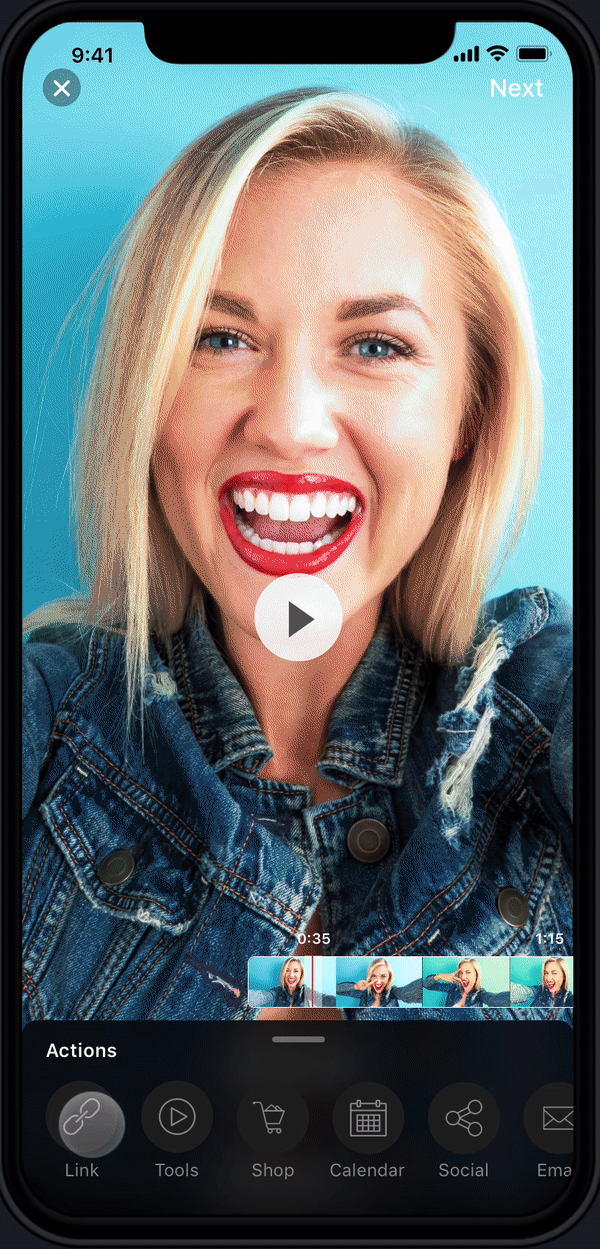
The winning direction: a full-screen view with an expandable iOS-style card at the bottom for actions. Inspired by Instagram's interaction model. This kept the video content front-and-center while providing a clean, familiar pattern for interactive elements.
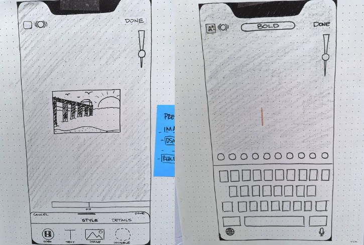
Sketches & Wireframes
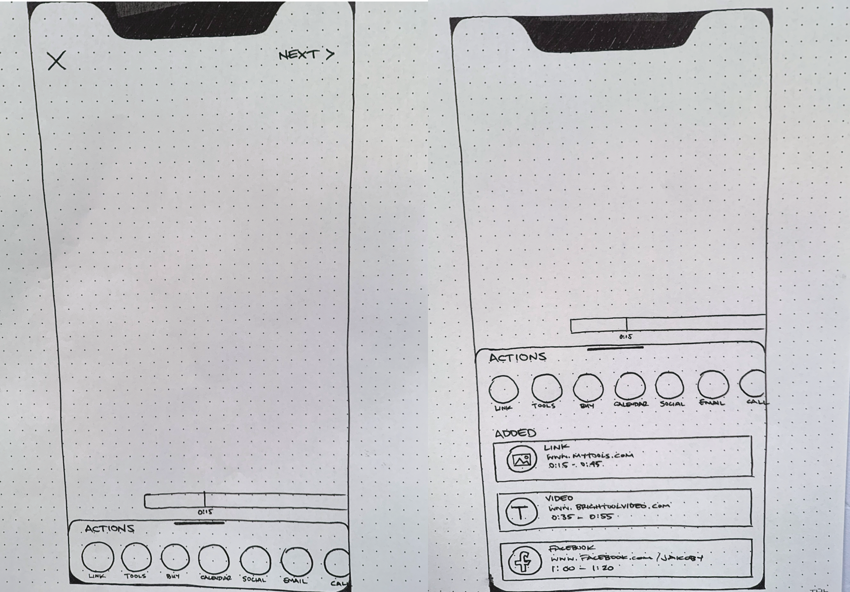
Design Solution
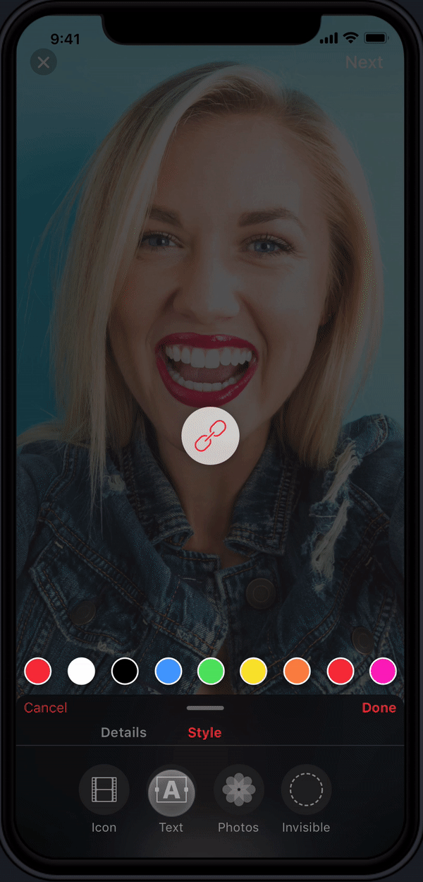
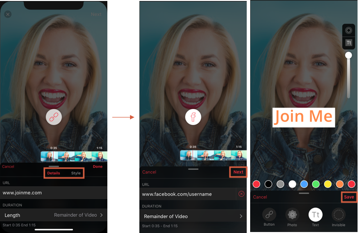
- •Full-screen video display always visible with an expandable/collapsible action card overlay
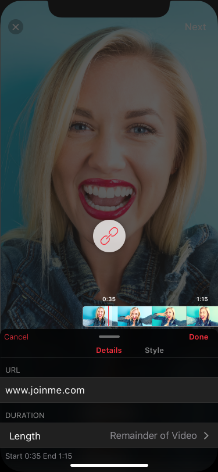
- •Seven interaction types: Link, Tools, Buy, Calendar, Social, Email, and Call. Displayed as cards over the video
- •Style tab positioned first in the flow to encourage visual customization (rings, opacity, text backgrounds)
- •Details tab for configuring interaction-specific inputs (URLs, emails, phone numbers, timing/duration)
- •Sequential navigation flow replacing "Done" with "Next" to ensure users engaged with styling before saving
High-Fidelity Designs
Prototype
User Testing
We tested with five participants and uncovered critical usability issues that would have been costly to fix post-development. The ring icon. A thin icon positioned in the top-left corner. Was nearly invisible. Users could style indefinitely without progressing, and the Details-first sequence caused most users to abandon the Style step entirely.
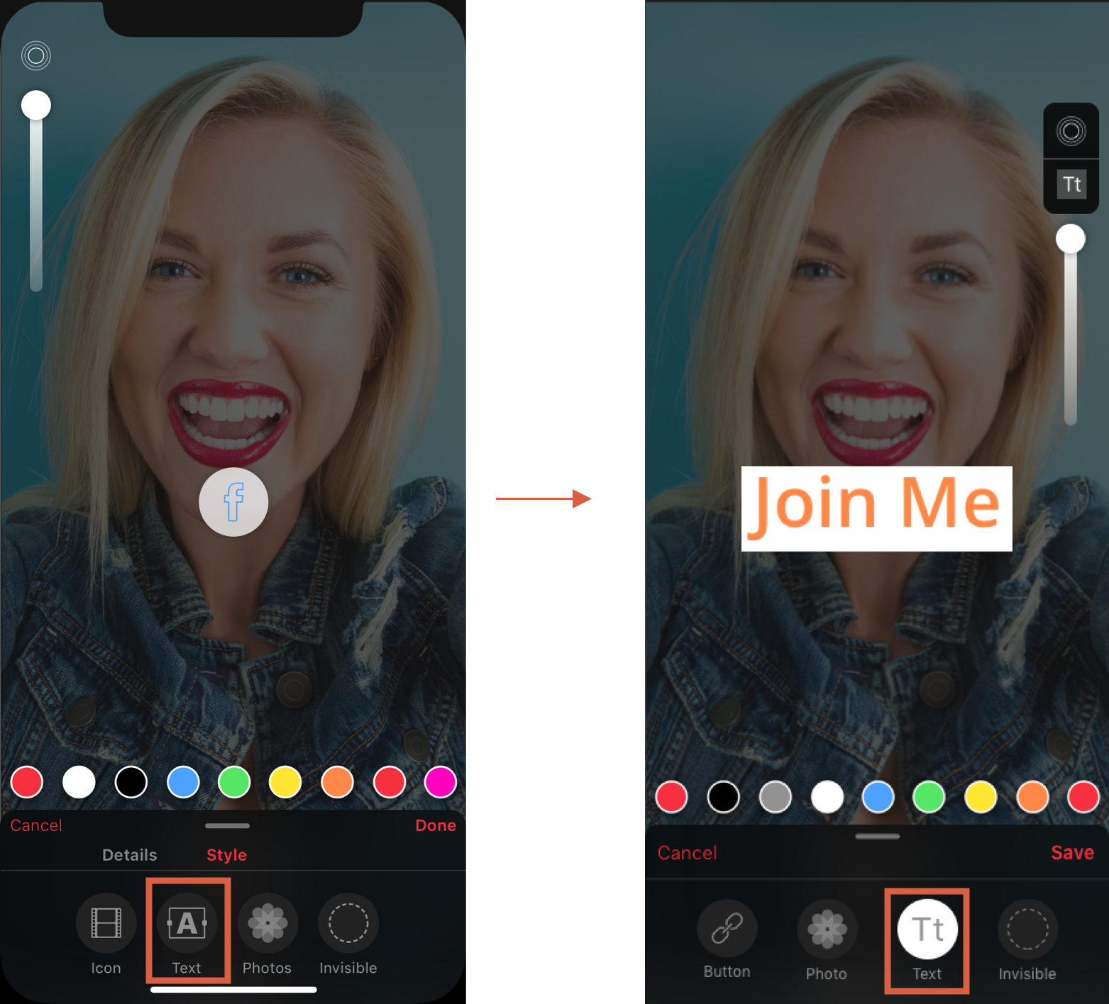
The custom text icon we designed also failed. Users were confused about its purpose. A humbling reminder that established symbols serve users better than novel but unfamiliar alternatives.
Iterations
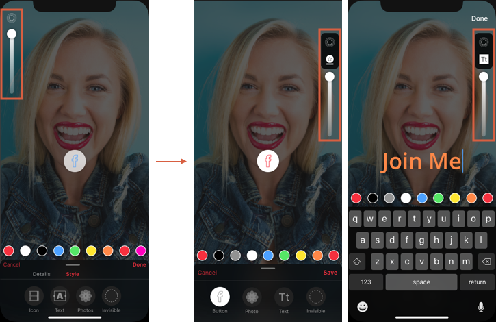
- •Ring/background icon: repositioned to the right side with a visible background container, placed lower for better discoverability
- •Navigation flow: replaced "Done" with "Next" button forcing sequential progression from Details to Style, then "Save". Ensuring every user engaged with the style options
- •Text icon: abandoned the custom icon entirely and returned to the standard, universally recognized text symbol
Iteration Results
An Honest Aside on UI
The white-labeled UI was not my favorite. It was an older look, decided largely by leadership before this project started, and updating it wasn't a priority. So on the side, I gave the designs my own twist to show what the interface could look like with a fresher take. Not a deliverable. A signal of where I'd take it given the room.
Key Learnings
Quick user testing prevents costly development rework. Even brief five-person sessions surface critical issues that save weeks of engineering time.
Design decisions require justification. When leadership vetoes a decision without rationale, it undermines team confidence and process integrity. Something I learned to push back on constructively.
Test "okay" concepts early rather than perfecting flawed assumptions. The custom text icon had high internal confidence but failed immediately with real users.
Reflection
One process gap I'd address in future projects: we moved from wireframes directly to high-fidelity designs without paper prototype testing. Low-fidelity validation would have surfaced several of our usability issues even earlier and at even lower cost. The lesson reinforced my commitment to testing at every fidelity level.